
Role
UX/UI Designer · Graphic Designer
Duration
5 weeks
Tools
Figma, Illustrator, Photoshop

Designing a playful, user-friendly website and visual identity for a psychotherapy practice that blends professionalism with a warm, game-inspired atmosphere to build trust and improve client engagement ✨
Context & Goal
Building the foundations of Mind Inn
Mind Inn Therapy is a unique psychotherapy practice that combines professional mental health services with a fun, approachable tone inspired by video games and board games. The client approached me to create a full brand identity and website that reflect their core values of empathy, humor, acceptance, and comfort.
⚡️ The Goal: Design a digital experience that communicates trust and emotional safety while embracing a sense of adventure and playfulness.
A key challenge was striking the right balance by ensuring the design remained professional and respectful of serious topics, while integrating whimsical, game-like elements without being mistaken for an actual gaming site.
My Contributions
- Developed a complete visual identity and branding system
- Designed a fully responsive website from concept to prototype
- Created a marketing strategy aligned with the client’s values and tone of voice
- Produced supporting print materials for promotion and offline presence
Research & Discovery
Exploring how therapy fits digital space
To design an effective brand and website for Mind Inn Therapy, I first needed to understand both the mental health industry and how therapists, particularly those with a younger target audience, build their client base.
The client expressed a clear desire to attract individuals between the ages of 18 and 35, drawn to the practice’s unique, game-inspired brand personality.
Research Goals
- Understand the goals and values of the business
- Identify user needs and expectations from a therapy website
- Analyze how modern therapists find and connect with clients
- Evaluate competitors’ branding, content strategies, and user experience
Expert Interviews
I conducted short, informal interviews with five independent therapists, each running their own practice. The conversations focused on how they market their services, reach new clients, and the role their websites play in that process.
Key Insights
- Word of mouth remains the strongest channel for acquiring new clients
- A consistent and authentic presence on social media (especially Instagram and TikTok) is crucial
- Websites serve as credibility hubs, used mostly by potential clients after discovering the therapist elsewhere

Therapist Interview Questions & Key Insights
Competitive Research
I analyzed the branding, content, and website design of several well-known therapists, both locally in Serbia and globally. Many had active online profiles and created engaging content that addressed serious topics in short, digestible formats.
When reviewing their websites, I noticed a recurring pattern: many were outdated or lacked a clear visual identity. While functional, they often didn’t reflect the engaging personality shown on their social channels.

Therapist TikTok Competitive Analysis
Conclusion
This research highlighted an opportunity to position Mind Inn Therapy differently: with a modern, warm, and user-friendly website that reflects the brand’s playful yet professional tone.
By combining competitive analysis and interview insights, I was also able to define a basic marketing strategy and brainstorm future content ideas that aligned with both business goals and audience needs.
Define
Setting the stage
Problem statement
Young clients often feel intimidated or disconnected from traditional therapy websites, which tend to appear clinical, outdated, or overly formal. Mind Inn Therapy needed a welcoming, trust-building digital experience that retained a sense of professionalism while embracing the brand’s fun, game-inspired personality.
Primary Users
Individuals aged 18 to 35 seeking therapy in a space that feels approachable, engaging, and emotionally safe. This audience is likely to be familiar with digital culture, games, and storytelling, and is drawn to a therapist who feels relatable and modern.
Business Goals
- Build a strong and credible online presence
- Increase visibility and client intake through clear communication of values
- Use storytelling, much like in games, to introduce the therapist’s personality, methods, and practice
- ”Seal the deal” for potential clients who arrive via social media or word of mouth
- Maintain a tone that feels both professional and friendly, with modern and playful visual elements
Design Challenges & Considerations
One of the biggest challenges was striking the right balance between fun and serious, playful and professional. The brand draws inspiration from gaming culture (e.g., Dungeons & Dragons, board games), but it was crucial that the website not be mistaken for an entertainment or gaming platform. Instead, it needed to convey emotional safety and therapeutic credibility while still embracing personality and creativity.
Another design constraint involved the development process. The client planned to collaborate with a developer friend but wasn’t certain when the site could be coded and launched. To address this, I designed a clean website that could easily be implemented using drag-and-drop tools or a simplified development process.
The client published the site using Canva, following my visual direction and documentation. I also provided implementation guidance to ensure consistency once the site is officially developed.
“How Might We” Questions
- How might we create a safe, trustworthy space that still feels fun and adventurous?
- How might we present serious topics in a way that resonates with younger audiences without losing credibility?
- How might we guide visitors through a story-like experience that reflects the therapist’s approach and values?
Ideation
Exploring solutions guided by insights
Through close collaboration with the client, we explored multiple directions for the visual identity and website design using brainstorming sessions, moodboards, and early sketches. Guided by the insights gathered during research and aligned with the client’s business goals, we ultimately defined a direction that balanced storytelling, professionalism, and playful brand personality.
To reflect the game-inspired nature of the brand, we incorporated quest-like language, fantasy-influenced illustrations, and a calming color palette reminiscent of indie and board games.
Testimonials were intentionally excluded, as we discovered that word of mouth and public comments on social media already played a major role in building trust with potential clients.
The homepage was structured like a narrative, divided into sections that felt like chapters as an intentional nod to storytelling in games. Instead of hard-sell CTAs, the tone gently invites visitors to learn more and reflect, ultimately encouraging them to book an appointment at their own pace.

Wireframe Iterations: Multiple landing‐page layouts explored during ideation
Branding
Designing the inn’s atmosphere
Brand Objective
The brand needed to express a safe, comfortable space, whether in person or online, where clients could feel free to explore their thoughts and emotions. While primarily designed for a digital-first audience, the identity also considered practical aspects such as color use and typography readability for potential print applications.
Logo Design Process
After multiple rounds of iteration, we selected a logo that conveys curiosity, openness, and the subtle transformation that comes from therapy. The mark features a gender-neutral figure standing in front of an inviting doorway, symbolizing both the 'inn' and the moment of insight or clarity often experienced in therapy. This visual metaphor reflects the 'Aha!' moment of personal growth, while keeping the form simple and instantly recognizable.
Color Palette
The brand colors combine warm beige and orange tones, evoking the cozy, welcoming feel of an inn or board game, with a balanced purple hue that symbolizes the mind, creativity, and the digital world. Together, the palette communicates both comfort and professionalism, while supporting the playful, fantasy-inspired theme.
Typography
Typefaces were chosen for their readability and friendly, approachable forms, with subtle fantasy cues that echo the brand's narrative tone. They support both clean layout structures and playful micro-interactions, depending on context.
Supporting Elements
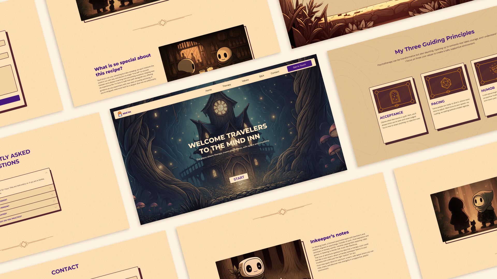
The custom illustrations draw inspiration from the storytelling style of indie games. They are carefully sequenced throughout the site to create a visual journey, from the hero section to the character of the innkeeper, who represents the therapist himself. Even the therapist is illustrated as part of the world, inviting users into the experience. These illustrations add personality and warmth, while the overall layout maintains clarity and structure, striking a balance between a traditional therapy site and something far more imaginative.
Brand Voice & Tone
The tone of voice is reassuring, gently curious, and subtly adventurous. Messaging is crafted to educate and invite self-exploration, using storytelling elements to guide users through the experience, just like a well-paced narrative or quest.

Examples of Brand Identity Materials
Prototyping & Testing
Making sure people feel welcome
After establishing a simple information architecture and refining layout ideas through quick sketches and wireframes, I developed a high-fidelity static prototype using Figma. The goal was to visualize the final look and feel of the website, demonstrate tone, and evaluate usability.
To validate the design, I conducted informal user testing with a small group of friends and former colleagues, several of whom matched the target age group of 18 to 35. I asked them to walk through the prototype and give feedback on a few key areas:
- Was the site structure intuitive?
- Was the “Storytelling” aspect clear?
- How did they perceive the tone and personality of the brand?
- Did anything feel confusing or out of place?
Key insights included:
- Paragraphs on some pages felt too long or dense for quick reading
- A few illustrations needed improved contrast and clearer sequencing to better support the narrative
- The brand tone was interpreted positively, with most testers describing it as calming, warm, and friendly
Based on the feedback, I made several targeted refinements:
- Shortened paragraph text to improve readability and flow
- Adjusted image contrast and re-ordered select illustrations for better clarity and visual rhythm
These small yet meaningful iterations helped ensure the final design was more user-friendly and aligned with both the storytelling intent and accessibility needs of the audience.
UI Design
We built the digital inn
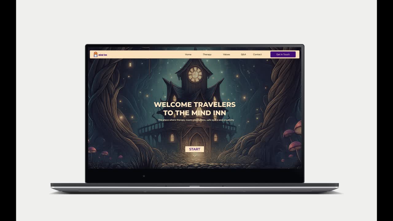
The final interface combines a clean, modular layout with subtle gaming-inspired details. Warm colors, fantasy-style illustrations, and carefully chosen type add a board game and 'inn-like' feel, supporting the brand’s story-driven tone while keeping the experience clear, welcoming, and professional.
Collaboration & Development
A shared journey, not a solo quest
I worked closely with the client through weekly video calls, sharing screens to review progress and align on decisions. This consistent communication helped us stay on the same page and address design or content questions as they came up.
For handoff, I delivered all visual assets along with a brand guide covering tone of voice, logo usage, illustration guidelines, and social media templates. Since the client expressed interest in expanding his content through vlogs, short-form videos, and streaming, I also created a basic content strategy for future growth.
While the site was originally intended to be coded by a developer, the client ultimately chose to build it in Canva. I adapted the designs to fit Canva’s limitations while maintaining visual integrity, and provided clear documentation to support a potential transition to full development later on.
Results & Impact
A clear win!
The client was very pleased with the design direction and final outcomes. We stayed in touch over several months, during which I provided additional graphic assets and offered continued support on design and marketing strategy.
Within six months of launching the brand and website, the client reported a 180% increase in new client inquiries.
Following my suggestion, he conducted a short survey among clients, and 66% indicated that the branding and website positively influenced their decision to reach out.
Together, we successfully established a strong digital presence across LinkedIn, Instagram, TikTok, and Facebook.
In the first three months, his social media posts consistently reached between 500–1,000 viewers, helping build early momentum and trust with his target audience.
Conclusion & Reflection
Mind Inn changed my mind
This project was deeply shaped by research and user needs. It showed how thoughtful branding, even in a traditionally serious field like psychotherapy, can be unique, empathetic, and engaging when built on a strong understanding of the audience and market.
One of the key takeaways for me was the importance of collaboration. Regular communication, idea exchange, and iterative testing helped us reach a result that was both creative and grounded in real-world value. I learned that it’s often more effective to start small, test ideas, and build from there than to aim for a “perfect” solution from the start.
If I could change one thing, it would be having a clearer plan early on for how the site would be built. Knowing from the beginning that the final product would be built in Canva could have helped streamline the design even further or allowed me to assist more directly in the implementation. That said, I’m confident the fully developed version will be live soon and will bring even more impact.
I’m proud of how Mind Inn Therapy turned out, and I’m excited to see it continue growing and reaching people through its distinct, story-driven approach to mental health.
The Mind Inn Website
