Role
UX/UI Designer
Duration
3 weeks
Tools
Adobe XD, Figma, Zeplin, Illustrator

Revisiting a meeting room scheduling app I first designed during a UX/UI internship at NewTec Solutions. What started as a simple tool for booking rooms and checking availability has been redesigned with smoother user flows, a clearer interface, and a more polished visual design ✨
Background
Revisiting my first project
During my final year of studies, I joined NewTec Solutions as a UX/UI Design Intern. For four months, I worked alongside senior designers, project managers, developers, and QA testers, contributing to various tasks across design, development, and testing.
I learned how to apply design processes in a real-world environment and gained a solid understanding of HTML and CSS principles. In addition to my main projects, I was involved in several smaller design assignments, which helped me explore different aspects of UX and UI design.
The Challenge
One of my key projects was the Meeting Room Scheduling App, a tablet-based tool for employees and managers to check room availability and schedule meetings. The goal was to create a simple, functional application that could later be expanded with more advanced scheduling features or adapted for B2B use.
At the time, my supervisors were pleased with the outcome. However, after a few years of professional experience, I saw an opportunity to improve it. I decided to revisit the project to refine the user flow, make the interface more intuitive, and bring the visual design to a higher standard.
Research & Discovery
Building on a solid foundation
During my internship, my first task was to understand how meeting room scheduling apps are typically designed and used. I began with a competitive audit, analyzing similar tools to learn how they display availability, manage bookings, and optimize the user experience. Once I had a clearer understanding of common patterns and pain points, we held a brainstorming session.
These sessions took place several times during the project. The first one focused on identifying user needs. With input from three senior designers and a product manager, we outlined key expectations and frustrations of employees relying on scheduling tools for daily tasks.
📍 The app’s original goal was straightforward: allow employees and managers to quickly check room availability and book meeting spaces.

Home Page: Before and After Redesign
To challenge and refine the design, I asked a series of “what if” questions to uncover edge cases and usability concerns:
- What if a user needs to schedule a meeting in under 30 seconds?
- What if a meeting room gets double-booked?
- What if someone needs to see all available rooms at a glance?
- What if a meeting runs overtime?
- What if a user needs to schedule multiple meetings in one session?
- What if the scheduling process needs to be accessible from shared tablets without individual logins?
Also, one of the biggest issues I identified was the availability bar, a UI element meant to simplify bookings but which often caused confusion.

Early concept of the time bar from a previous design
Through this redesign, I realized that usability matters more than novelty. The solution should be intuitive and easy to navigate, not reinvent familiar patterns that already work. From this analysis, several improvement opportunities emerged:
- Replacing the confusing availability bar with a button that opens a clear calendar view (similar to Google Calendar)
- Modernizing the overall UI for improved readability and ease of use
- Defining a scalable approach for future feature expansion, such as B2B use cases
These insights shaped the redesign’s focus: streamlining key actions, improving visibility of information, and adding smart features to simplify daily use.
Define
Mapping out the core user flow based on user needs
Problem statement
Employees need a fast, intuitive way to check meeting room availability and schedule meetings without unnecessary steps or confusion.
User Goals & Needs
- Book a meeting room quickly, ideally in under 30 seconds
- Instantly see available time slots
- Avoid double-booking conflicts
- Schedule multiple meetings without repeating the entire process
- Access the scheduler easily from shared office tablets, without constant logins

A user flow that outlines the steps for meeting room scheduling
User Journey — Before & After
Before Redesign: Room availability was shown in a horizontal bar at the bottom of the screen, which wasn’t immediately clear. Users had to swipe to see more time slots and navigate to a separate options screen to view full schedules or multiple days. This bar element, intended to simplify booking, often caused more confusion and cluttered the interface.
After Redesign: The new home screen is cleaner and easier to navigate. By removing the confusing time bar, the interface feels more intuitive. A dedicated button opens a clear calendar view, giving users an instant overview of room availability.

A sitemap for the Meeting Room Scheduler app

Ideation
Exploring new feature possibilities
To improve the Meeting Room Scheduling App, I explored multiple ways to streamline the booking process while keeping the interface simple and familiar. I started with quick sketches and wireframes to visualize different approaches, focusing on how users interact with tablet apps in shared office environments.

Various Wireframe Iterations
Several key feature ideas emerged from this exploration:
- Instant Schedule Option: A fast-track button to book a meeting in the next available time slot with minimal input.
- Multi-Meeting Scheduling: The ability to add multiple bookings in one flow, without restarting the process each time.
- Clear Availability Overview: Replacing the confusing availability bar with a button that opens a familiar calendar view, allowing users to see all free slots at a glance.
- Tablet-Friendly Interaction: Large touch targets, minimal steps, and a clean layout designed for quick, on-the-go use in shared spaces.
These ideas shaped the core of the redesign, ensuring the app stays functional, easy to use, and scalable for future needs.


Finalized Wireframes
Design Process
Focusing on usability over novelty
With clear goals from the ideation phase, I focused on turning these ideas into practical design solutions that improve usability without adding unnecessary complexity.
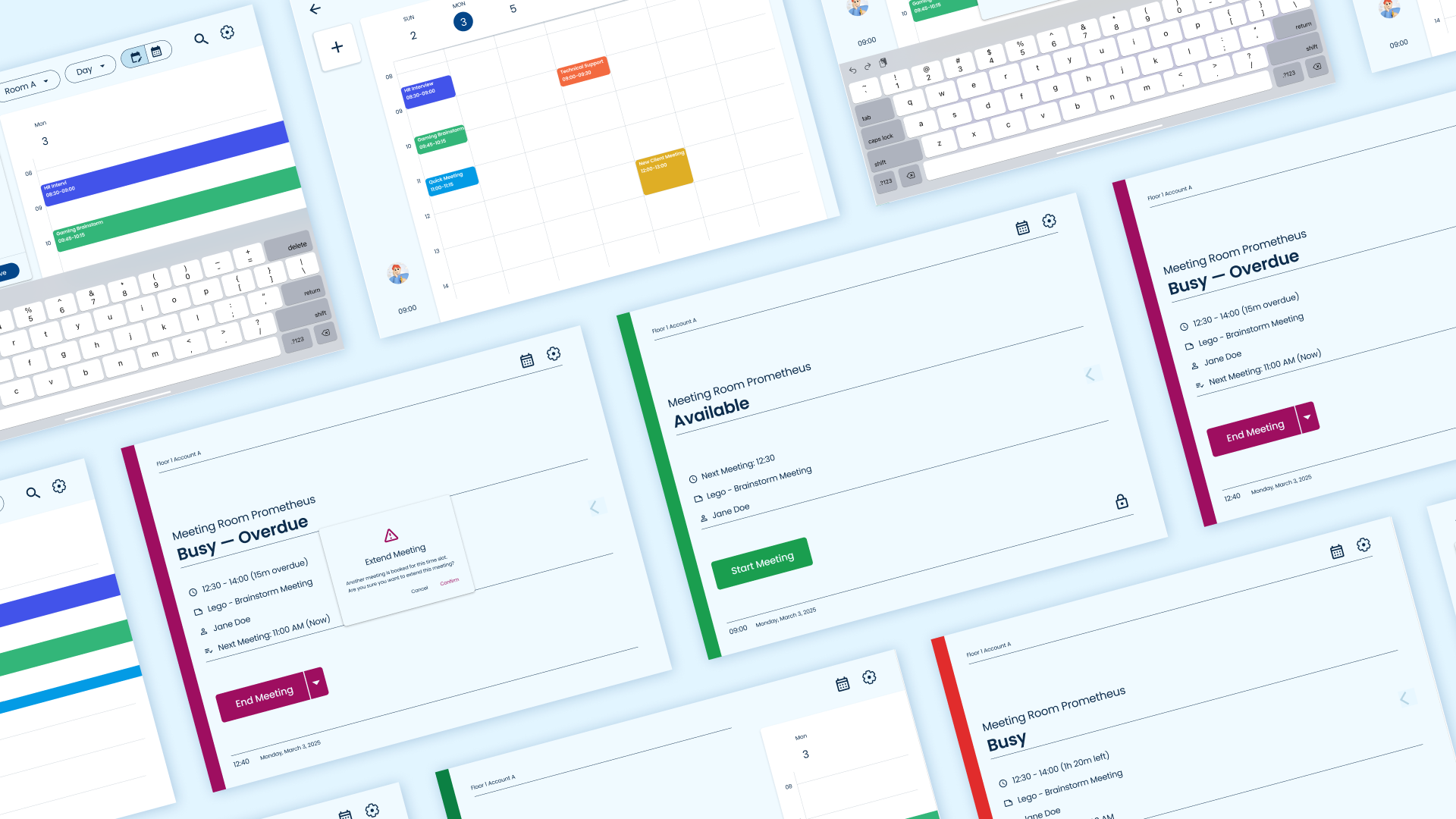
The biggest change was simplifying how room availability is presented. I removed the confusing horizontal availability bar and replaced it with a dedicated button that opens a calendar view. For added convenience, users can also swipe once to preview time slots or swipe twice to open the full calendar.
The booking flow was also reworked to reduce the number of steps. From the home screen, users can now access scheduling options with a single tap.

Same screen shown through various design phases
Given that this app is used on shared, wall-mounted tablets, I designed with large touch targets, clear spacing, and readable text sizes optimized for standing users who may view the screen from a distance. The visual design remains subtle and professional, avoiding unnecessary distractions.
All design decisions were guided by three principles:
- Clarity over novelty
- Efficiency of use
- Scalability for future needs
The result is a cleaner, more intuitive interface that supports quick and easy meeting scheduling.
Prototyping & Testing
Validating the new design
During my internship, I built a high-fidelity interactive prototype using Adobe XD and InVision, focusing on the main user flow. I conducted usability testing with company colleagues to identify early issues, and ran minor A/B tests comparing different layout options for the availability overview.
For the recent redesign, I created a new prototype in Figma. I conducted informal usability testing with friends, asking them to complete tasks like finding a room, booking a meeting, and adding another booking.
Key feedback included:
- Calendar view was much clearer than the old availability bar
- The “+ Add Meeting” button needed better visibility
- Action button contrasts needed improvement
Based on this, I made refinements:
- Improved “+ Add Meeting” visibility
- Increased button contrast
- Adjusted touch target sizes for tablet use
While no formal A/B testing was done during the redesign, iterative feedback helped validate design decisions and ensure a smoother booking experience.
UI Design
Designing for a wall-mounted tablet
For the redesign, I aimed for a clean and functional interface that supports fast interactions. Since the app is displayed on wall-mounted tablets next to meeting rooms, clarity and subtlety were priorities.
Color Palette
Colors were adapted from the company’s branding but softened to avoid being distracting for nearby employees. Accent colors guide interaction without overwhelming the visual experience. Primary actions use a calm blue for visibility, ensuring clear focus.
Typography
A modern sans-serif font was chosen for readability both up close and from a distance. Font sizes were optimized for glanceability in office environments, making key information like time slots and room names easy to spot.
Components & Layout
Buttons and input fields were designed with large touch targets. Layouts follow a clean grid for consistency, with generous spacing to prevent accidental taps. Icons are simple and familiar to reduce learning effort.
Tablet Considerations
Since the tablets are mounted and shared, the design avoids clutter, prioritizes essential actions, and ensures comfortable interaction even in quick-use scenarios.


Screens Overview
Results & Impact
Not shipped, but it got me rolling!
Although the redesign hasn’t been implemented, the improvements are clear. The new design streamlines key actions, reduces confusion, and offers a much clearer overview of room availability.
Key outcomes:
- Faster, simpler booking flow
- Improved visibility of available time slots
- Cleaner, more intuitive UI
- Optimized for wall-mounted tablets in shared office spaces
These improvements would reduce user frustration, speed up the booking process, and make the app more effective in its intended environment.
Conclusion & Reflection
Looking back and moving forward
This project marks both the start of my UX/UI journey and how far I’ve come since. The original Meeting Room Scheduling App was my first real design challenge, but revisiting it allowed me to apply more mature UX thinking.
Simplifying flows, improving clarity, and designing with scalability in mind were key lessons. The experience reinforced how valuable simplicity is in creating effective user experiences.
If given the chance, I would test this redesign in a real environment to further refine it. I’m confident it would offer a faster, clearer booking experience while remaining practical to develop and scale.
